Embedded Video In Material Design
Mini Case Study: A Quest to Find The Hidden Embed Video Link on Google Drive
![]()
Introduction
In this mini case study, I uncovered one cryptic feature that is hidden beneath the depths of Google Drive: getting an embed link of a video on Google Drive. This mini case study was conducted in mid October 2018.
One day, I was updating my portfolio with demo videos of my p r evious projects. Uploading a video on Youtube will usually take a long time and I have no reason to upload it on Youtube, which is why I made my decision to upload my demo videos on Google Drive instead. It turned out it was a lot more difficult than I thought.
Problem
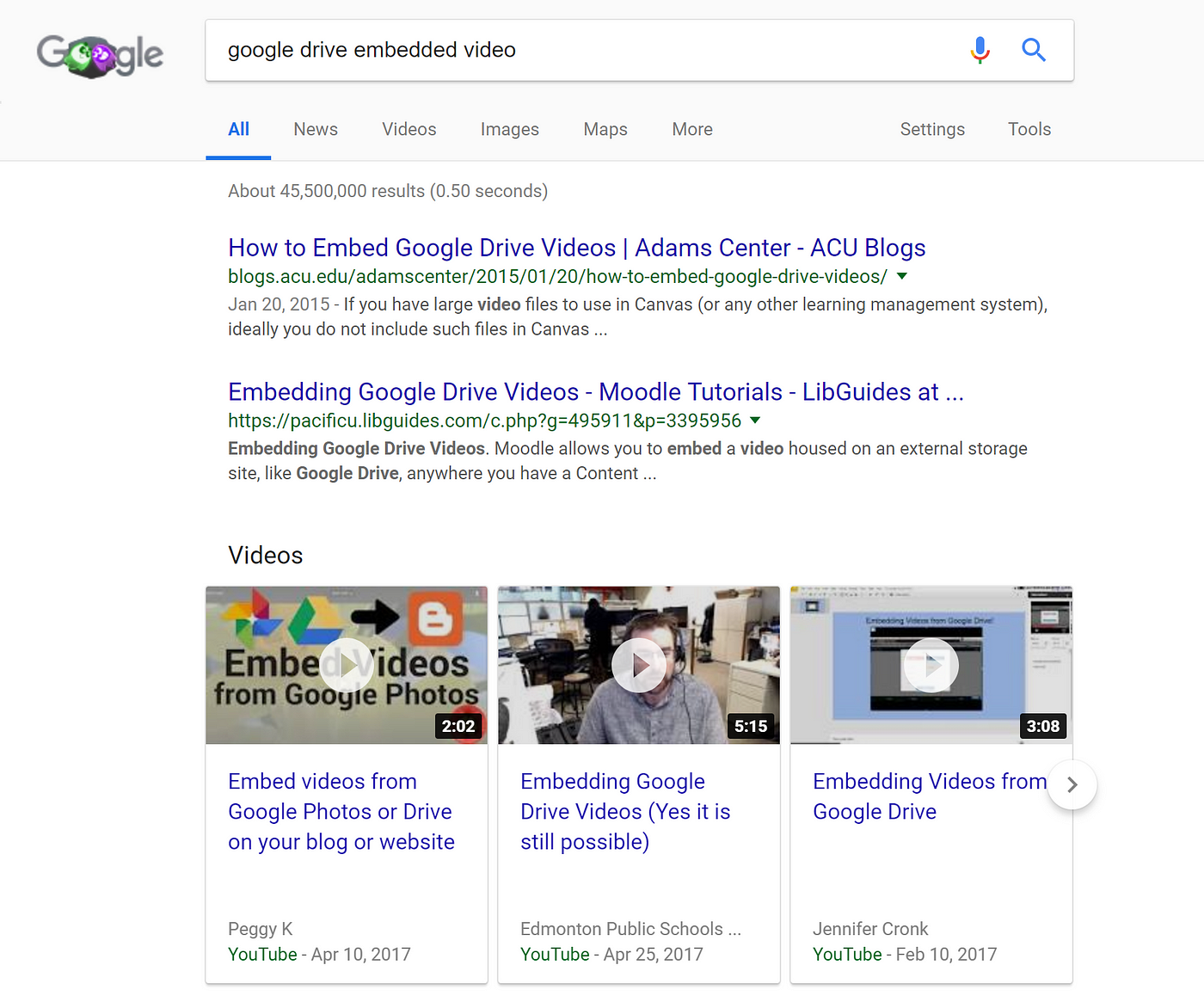
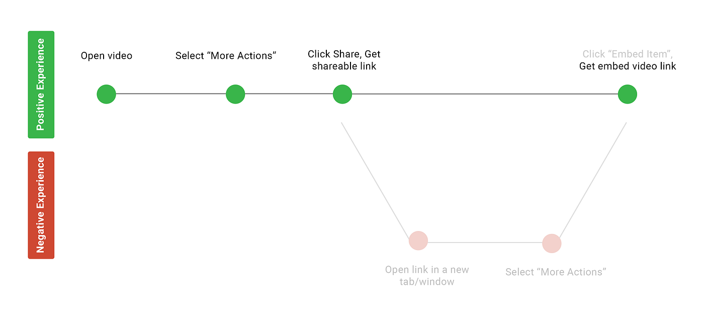
Surprisingly, it took me around 15 minutes just to get an embed link of a video. I had to search online how to get an embed video link on Google Drive. I found numerous sites, discussion boards, and videos, but unfortunately all of them were outdated. I couldn't find the embed video link until I found it on my own. Here are the steps to find the embed video link as of mid October 2018:
- Open video
- Select "More Actions".
- Click Share, Get Shareable Link
- Open the link in a new tab/window
- Select "More Actions"
- Click "Embed Item", Get embed video link
Other than the lack of updated resources, I was curious about what other factors led me to be confused in doing such a simple task. I analyzed and listed down multiple factors that affected me when I tried navigating the system.
Confusing Procedures
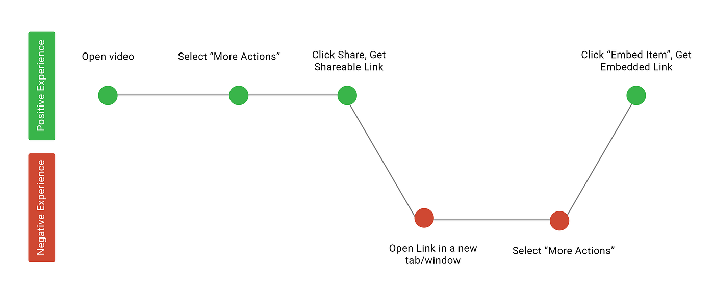
To see where the problem occurs, I made a user journey map. This is a good approach to understand user behavior, to identify the system functionality at a high level, and to demonstrate the way users interact with the system. From this user journey map, you can see there are 2 pain points.
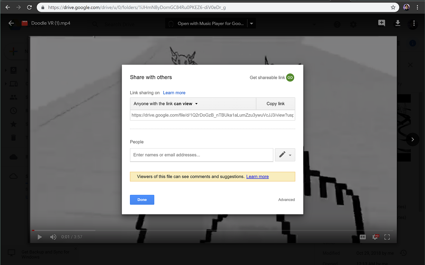
The first one occurs after generating the shareable link. I was confused to find where the embed video link was located. I thought I would find it if I clicked the "Advanced" button on the bottom right, but it wasn't there. Later, I opened the shareable link on a new tab. I thought it would open the exact same page as the previous one, but it turned out that the page was actually different.
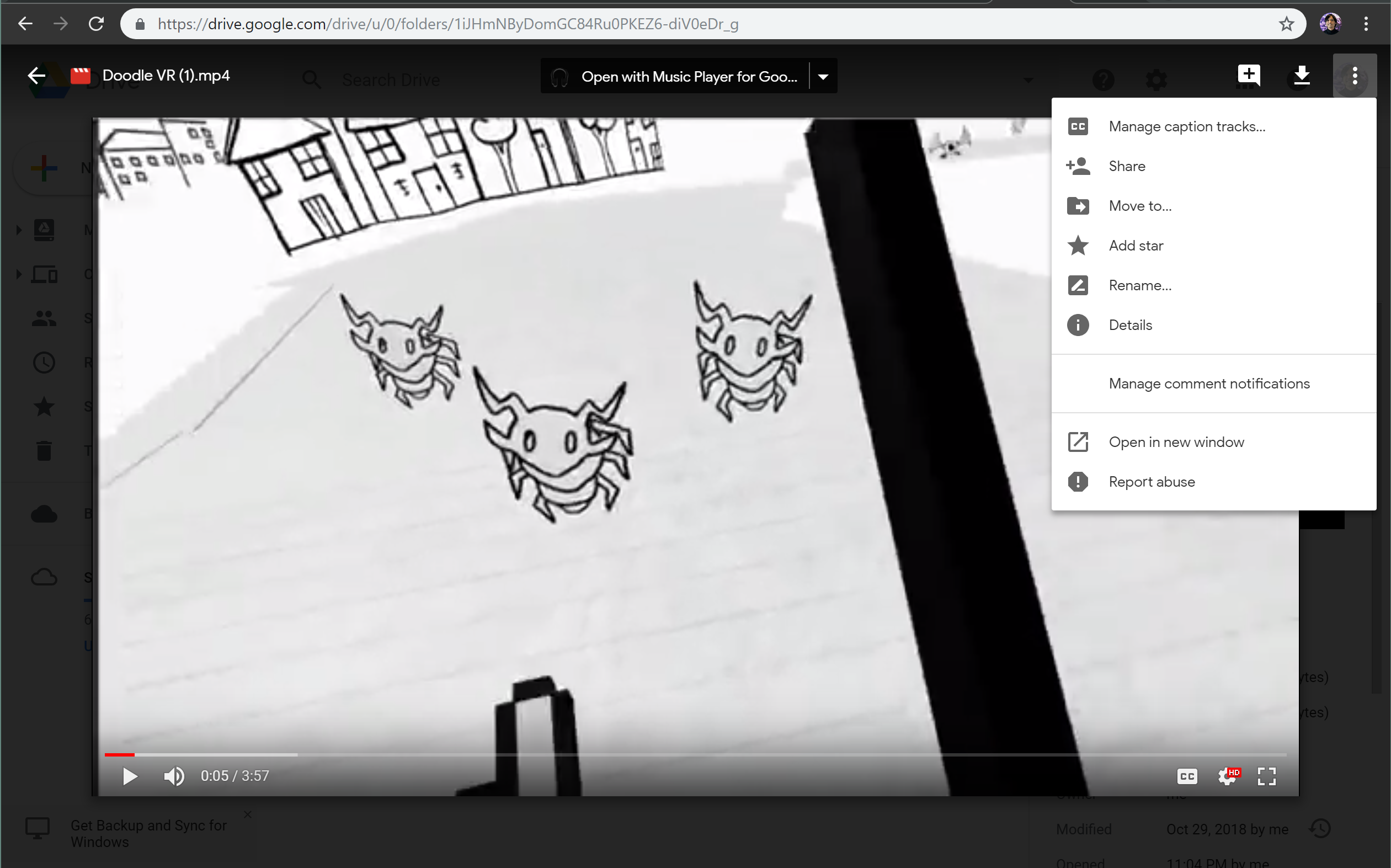
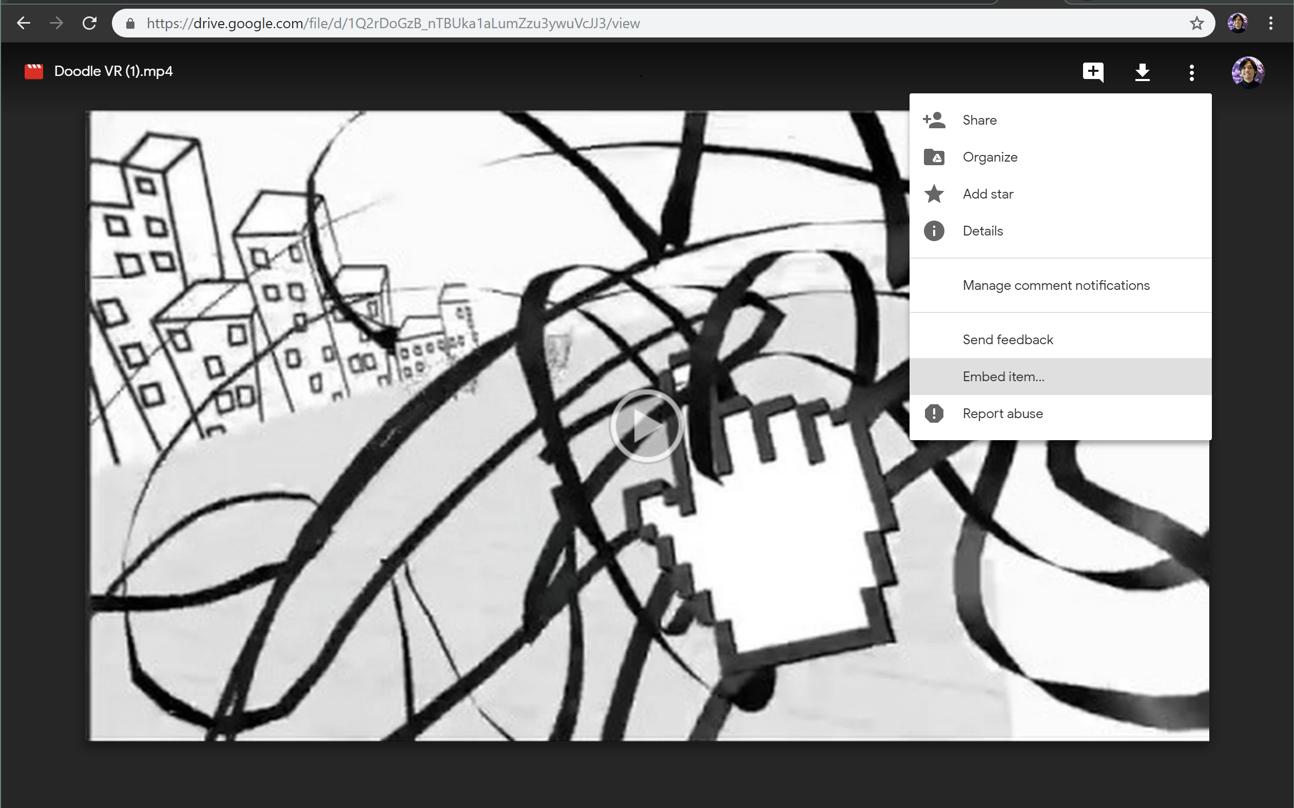
The second one occurs when navigating the options on the shareable link. When I opened it in a new tab, the options look very similar to the other page. The buttons on the top menu are very similar with minor differences, but the "More Actions" button have different settings. This confusion happened because the interfaces of 2 different pages are difficult to distinguish.
Indistinguishable Interfaces
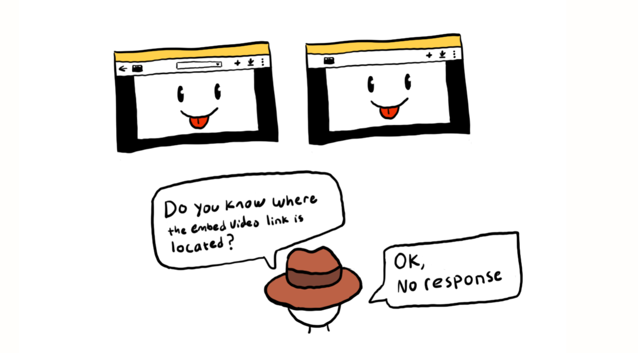
The gestalt principle of similarity says that similar elements are perceived to be more related than elements that are dissimilar. Similarity is useful in organizing objects through their characteristics within a group according to their shape, color, size, and orientation.
Google Drive retains a great consistency in its design. But in this case, it is too similar that you can't tell the difference other than by looking at the URL of the page. The page that has the embedded video link is the one on the right screenshot where you open the shareable link in a new tab/window. If you don't open the shareable link, the "Embed item" option will not show. It is not possible to get the embed video link on my Google Drive without opening the link in a new tab/window. The system should have explained the reason why you need to open the link in a new tab because forcing user behavior without telling the purpose of the action is not a good practice.
Design Inconsistency
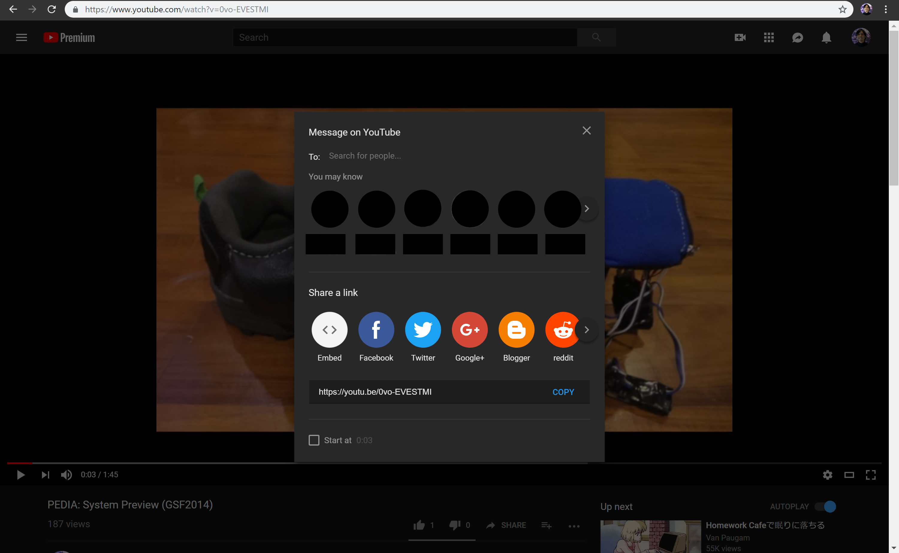
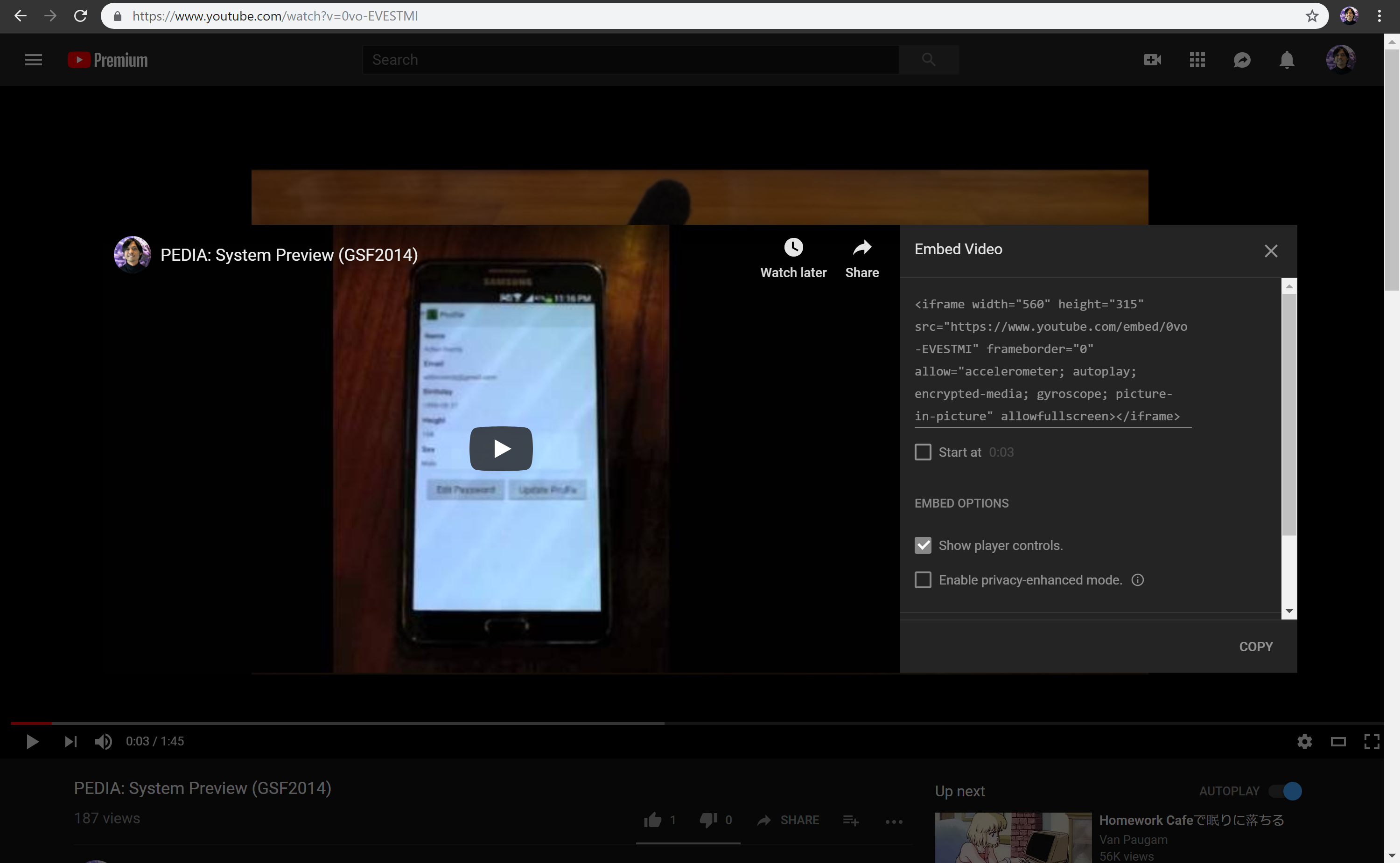
Youtube is a product under Google's ecosystem that primarily supports video sharing. When you select the "Share" button on Youtube, the "Embed" option shows up below the option where you share videos to your friends through email. After clicking the "Embed" option, it will show you the embed video link. This process is more structured and is more straightforward compared to Google Drive which requires you to perform several clicks before you get the actual embed link. Products under an ecosystem should have consistent flow, layout, & visual hierarchy.
User Testing
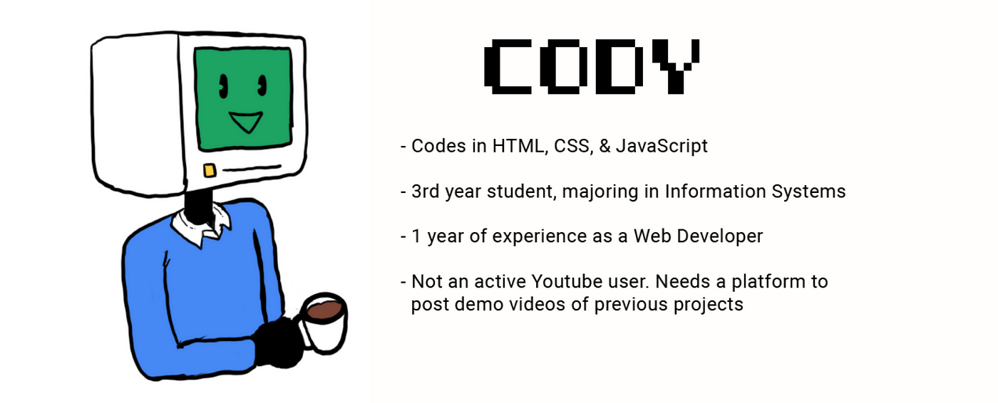
Curious to see if anyone has difficulty with finding the link, I decided to conduct a user testing session. I picked a combination of 5 Information Systems & Computer Science students in Penn State who are familiar with web development and have at least 1 year of experience as a web developer. I created a persona that I used as a reference which could represent the respondents for this mini case study.
Task:
Find an embed link of a video on Google Drive.
Goal:
To see how intuitive Google Drive is when it comes to embedding a video for web developers.
Method:
Think-aloud testing: let the respondents say what they are thinking, doing, and feeling at each step. If the respondents took more than 30 seconds, they are free to ask the answer.
Results:

None of the 5 students were able to find the embed video link under 30 seconds and they asked me how to do it. My assumptions were correct, they were lost in the first pain point: getting confused after generating the shareable link.
"Wow, didn't expect it would be that difficult."
"Why there were a lot of unnecessary steps?"
"How come Google has not addressed this problem?"
My Design Attempt
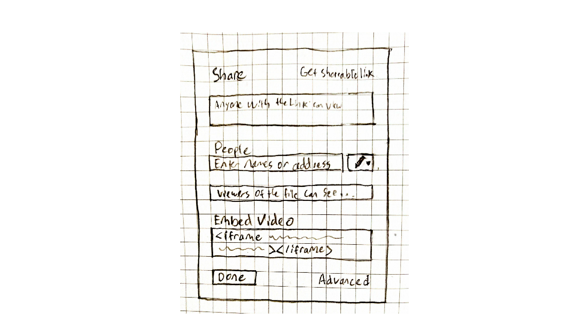
I made a wireframe design on my sketchbook before I recreated it on Photoshop. I wanted to make the process to be very simple and straightforward, which is why the process could be done in one page without opening a new tab/window. In my design, when you click "Get shareable link" where anyone with the link can view, the embed video link is automatically displayed underneath the option where users can share the video to email addresses. The layout is consistent with Youtube's share video layout and also faster than Youtube's share video layout in getting an embed link.
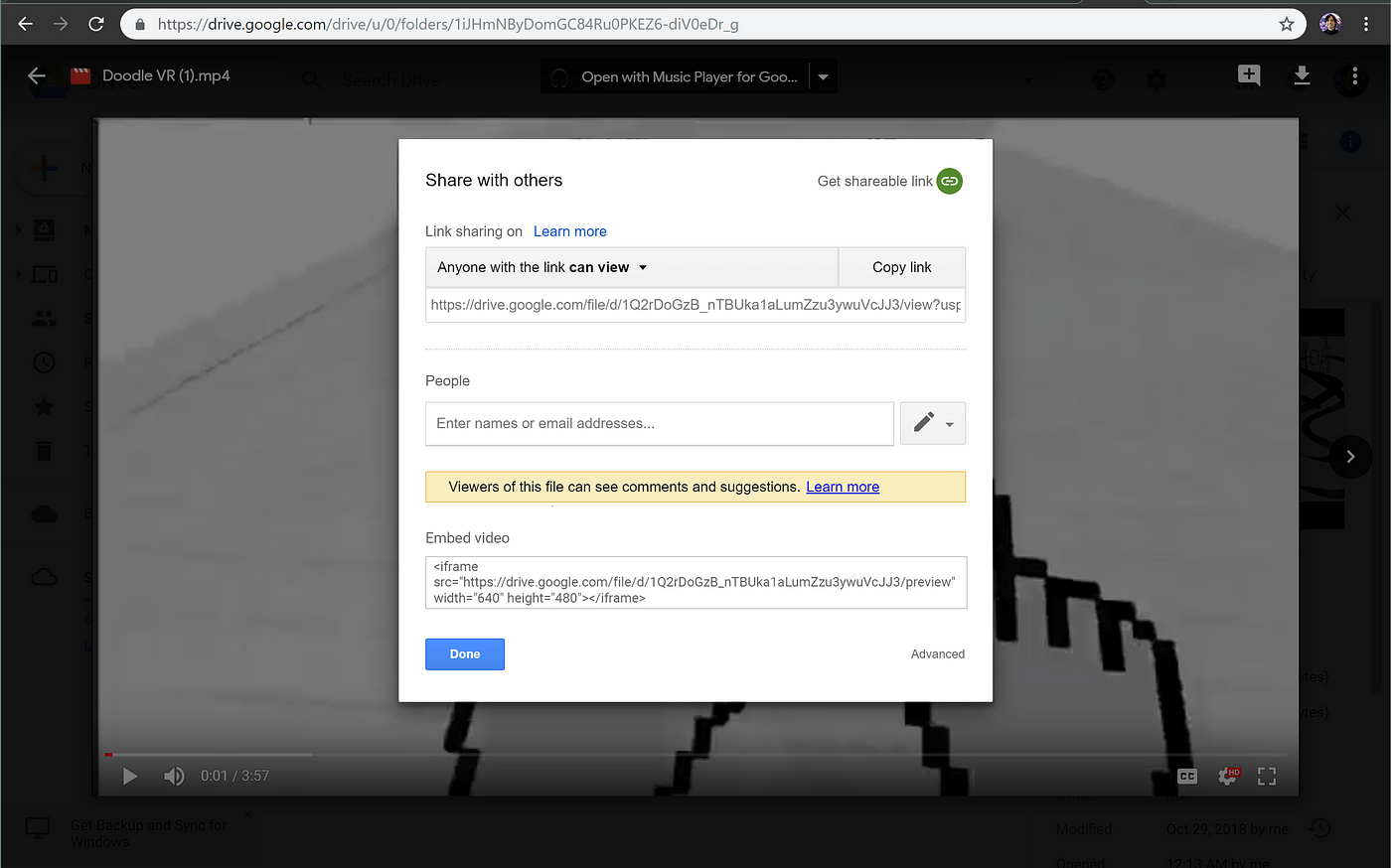
After I created the wireframe, I created a high-fidelity prototype to make it more realistic. Since Google Drive is using Material Design as its design system, I have to use the same design guidelines to preserve the consistency of the existing system. My design removes all the pain points described earlier which saves a lot of time and the process is faster, easier to understand, and more straightforward. The process can be done in 4 steps instead of 6 steps.
Conclusion
After I finished my design, I asked the 5 respondents again how they liked the design improvement that I made. All of them agreed that my design is more straightforward and is not confusing like the current design. I hope Google would be able to read my mini case study and redesign the method of getting an embedded link for a video to make Google Drive more accessible for web developers. Getting an embed link of a video on Google Drive will no longer be a hidden feature that becomes an urban legend on the internet!
"It's a lot easier to navigate than before and it saves me a lot of time!"
"Very simple and easy to learn."
"This is a small but great design improvement, you should be hired by Google for this!"
Thanks for reading my first mini case study! There is a possibility that I will continue writing mini case studies as an ongoing series on Medium. Please let me know if you have any advice or suggestions which could be helpful for me to improve my articles in the future!
The video used on this mini case study is Doodle VR, a virtual reality sandbox game for a hackathon where you solve puzzles and fight enemies with your own drawings.
All illustrations are made by myself, check out my Instagram @adlanar to see more of my drawings.
Feel free to check my web portfolio on adlanramly.com and feel free to follow on Twitter @adlanarv where I usually tweet about User Experience, Game Design, & AR/VR Experiments!
Embedded Video In Material Design
Source: https://blog.prototypr.io/mini-case-study-a-quest-to-find-the-hidden-embed-video-link-on-google-drive-bdb809ddeb41
Posted by: huertareplads.blogspot.com

0 Response to "Embedded Video In Material Design"
Post a Comment